

Lion of the Sky - Cover Process
Cover art is so hard how do all of you do it

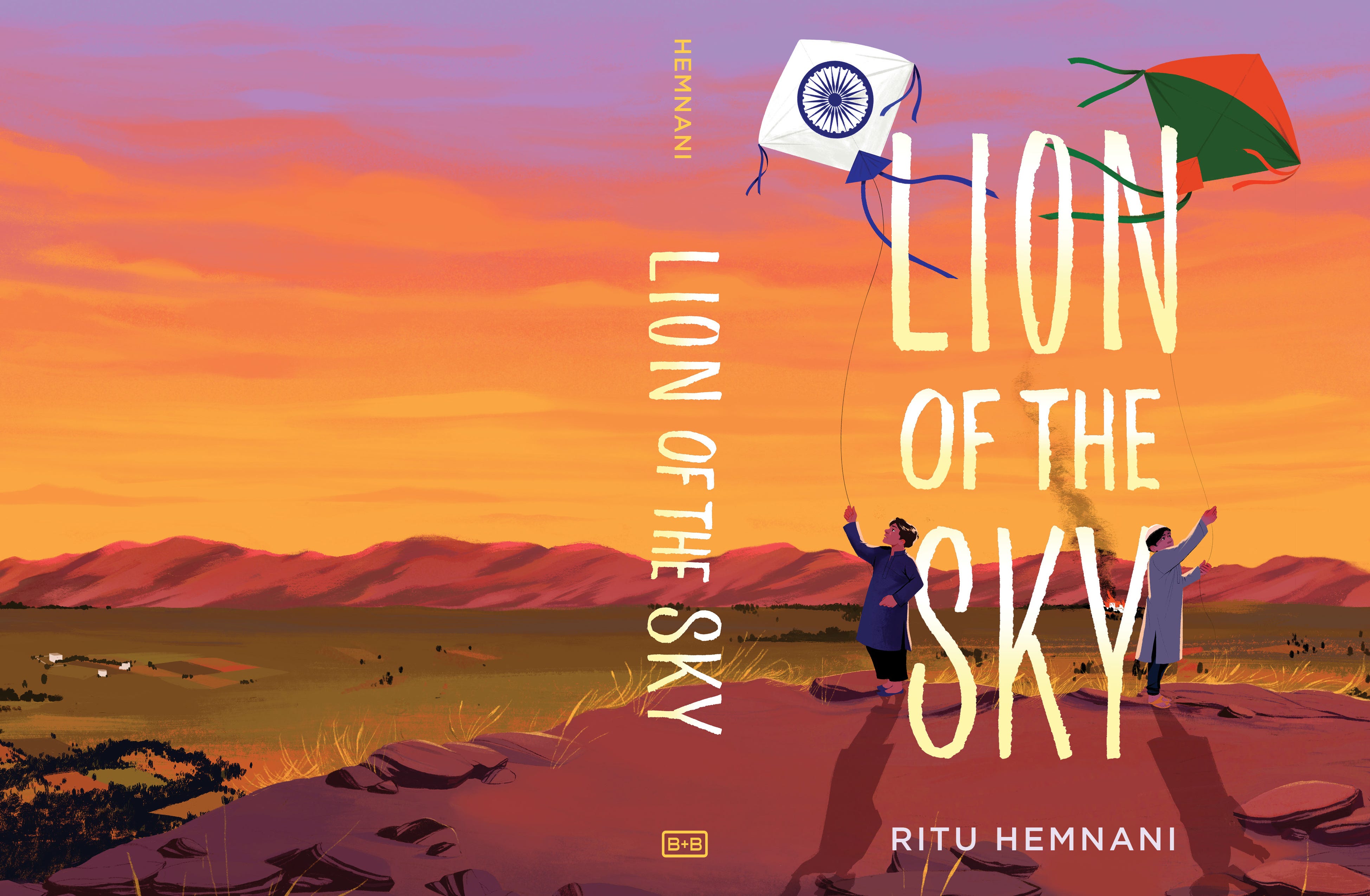
Hello! If you are on Instagram (the app I insisted to you I would not be spending time on) you’ll have seen this cover:
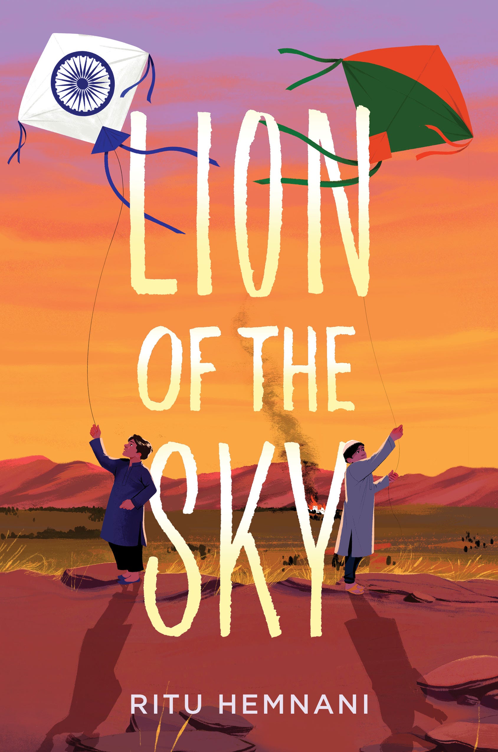
It’s for a book-in-verse called Lion of the Sky by Ritu Hemnani out May 7th of next year! The book follows two best friends in Sindh, Pakistan pre-partition and details their lives after the partition of India and Pakistan forces their families apart.
This was my first cover gig! Of course, I’d done the covers for the two picture books I worked on but somehow it feels scarier that this is the most prominent/only piece of art this book comes with. A cover has to sell the book without giving too much away. A teacher of mine in college warned against the instinct to include a narrative high point or climactic moment because that screws with the pacing. The reader is going into the book with too specific an expectation. Learning to focus on conveying a sense of place and time + tone of the book has been hard!
Fee: 4000 USD
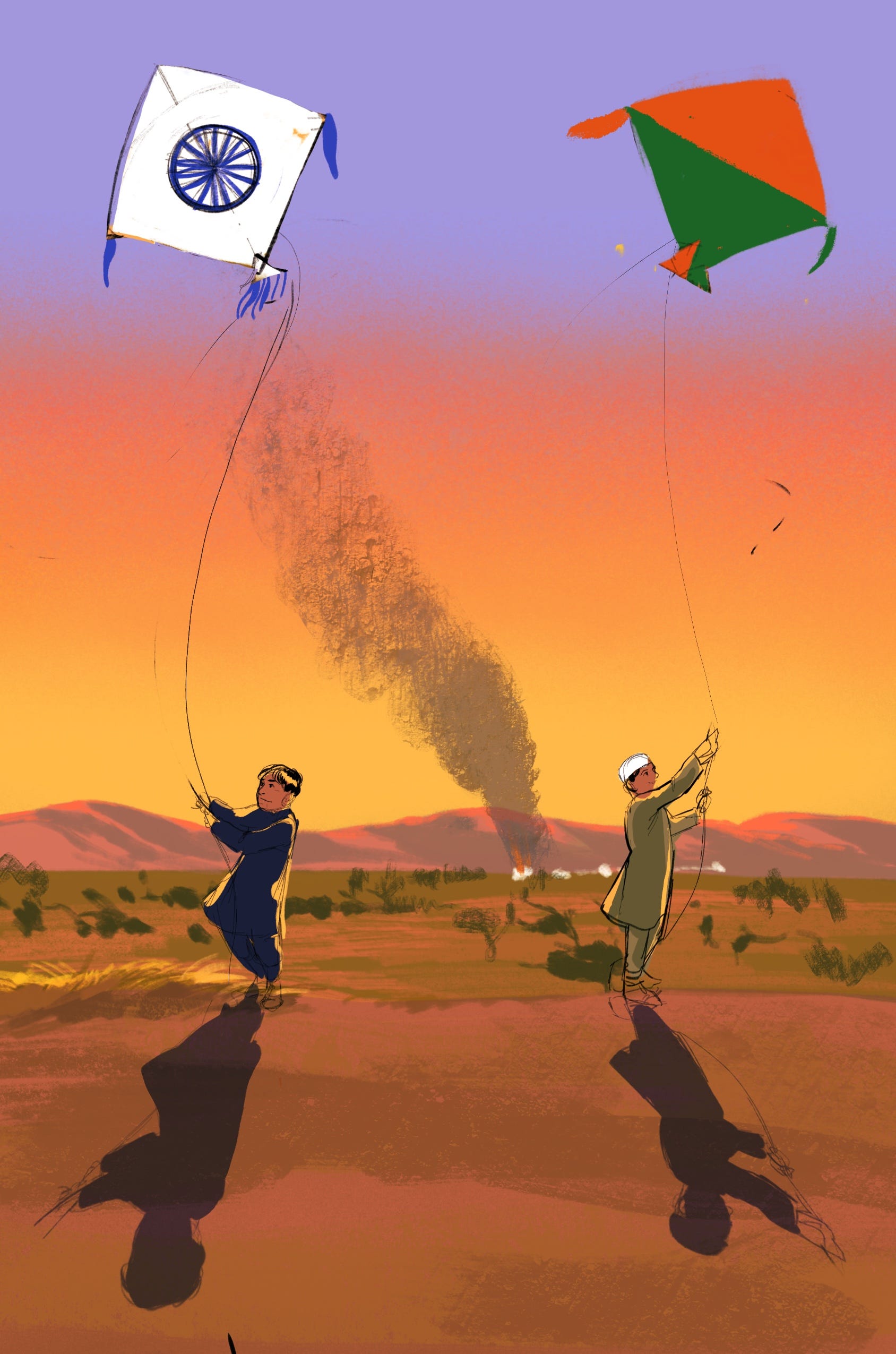
The brief I received was very clear and had a lot of reference images of the dry, brushy landscape around Sindh + the team was certain that they wanted a visual of the boys flying their kites together on the cover. The brief mentioned they wanted a timeless and literary quality and so wanted to stay away from close-up portraits and focus on landscape. The kites that the boys are flying are very specific in design and together, make up the Indian flag.
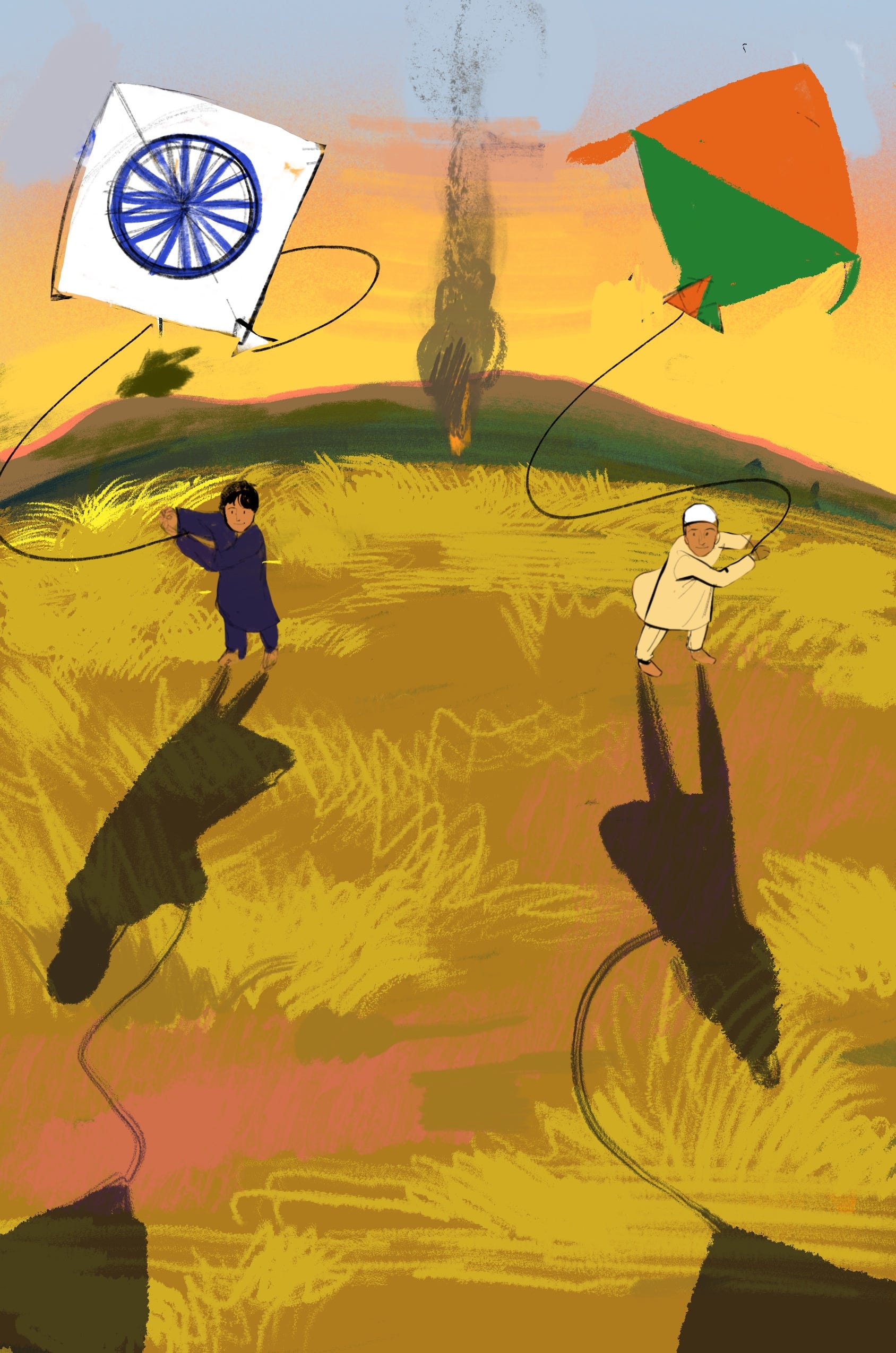
This is the first round of sketches I sent over. I was determined to add a sense of violence or dread to the otherwise pretty serene scene. I tried to throw in a train burning and a village on fire in the distance and had to be reminded that this was ultimately a book for children and the sense of violence had to be a little subtler!


None of this first round quite hit the tone they wanted so I sent over a second round of sketches with some more options:


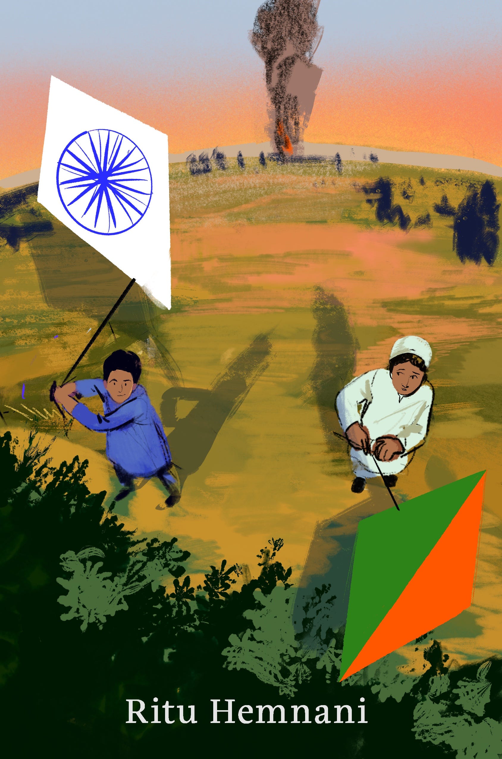
This second round was meant to have some sense that the boys were to be separated without being a gloomy piece of art. The sketch in the middle has their shadows tilting away from each other and the sketch on the far right has one of the boys looking worried as he looks out onto his kite soaring above the valley. The sketch they most liked though was the one from a top-down angle. I agree that this seemed like a nice way to give the kites prominence and have the figures be subtle!
The trouble was the big tree in the front. There was some concern that the lushness of the landscape didn’t quite match the. descriptions of the region the book is based in. I was worried that without the tree, the sense of a layered image would disappear. Plus, with this, we were losing some of the sweeping landscape behind the boys. Below are a couple of attempts to find some solutions to these issues. We tried some crazy fish-eye perspective approaches and I tried to introduce a sense of distance with the verticality of a smoke column.
Ultimately it felt like we’d lost the forest for the trees a bit and needed to start fresh instead of tweaking a sketch that simply didn’t have the bones we needed.
I sent over this sketch in an attempt to steer us in a different direction:
It had no fancy perspective, kept the landscape close to the descriptions provided, had the boys turned away from each other, and the sky very hot and dramatic the way the author wanted!
This is where I admit to you that I was somehow in extremely bad form for the length of this project (months!). I was a little burnt out, not keeping track of deadlines as well as I usually did, and not able to call up my usual visual vocabulary (how many hoops can I jump through to avoid saying the word “style”?) to address the subject matter. Usually what helps in these cases is to make a mood board of pieces of my own work that I felt addressed similar elements or took a similar visual approach that I am trying to achieve.

I tried hard to emulate the Tara who did this painting for an editorial piece ^ because it had all the elements (rocks! scenery! tiny dotted trees! sweeping sky) I needed for Lion of the Sky. I’d been avoiding my paints for a while at the time of making this cover (the paints were not!! painting!) and was feeling very much like the Tara who painted the editorial piece was a total stranger so I had to pivot a bit. I painted all of this cover digitally (rare for me!). My agent Chad suggested I try something that fell in between the very painterly approach and the very line-heavy ink drawings that populate my portfolio. Since those two are quite different from each other, it would be helpful to try to build a bridge between them, and cover design work can benefit from both, a painterly style and the sharpness of ink character drawings.
Unfortunately at the time what I came up with was this super busy rocky situation:

The cloudy sky added some body to the background but I was struggling with the large red-brown shape in the foreground. I tend to need to break up big shapes for some reason so this large piece had to get smashed into little rocks with their own busy detail. I was having a hard time finding that in between between lines and painterliness and was instead throwing both approaches into the piece and hoping they would build a bridge on their own!
The final cover I hope occupies that in between with some looser elements and textures + precision that lets you get a sense of the character’s expressions and the shapes of the rocks!